
Hacking Image Interpolation for Fun and Profit
Updated September 2026: This technique still works, but the web has changed a lot since I first wrote this post in 2019. Modern image formats and responsive image delivery make it even more useful in some cases, while also giving us better options when image detail matters.
Raster images normally look distorted or pixelated when enlarged, especially if they contain graphics or text. But there is an important exception: images that contain very little high-frequency detail.
Think smooth gradients, heavily blurred photos, soft lighting, and abstract backgrounds. These images can often be reduced to surprisingly tiny dimensions and then stretched back to fill a large screen with almost no visible loss in quality.
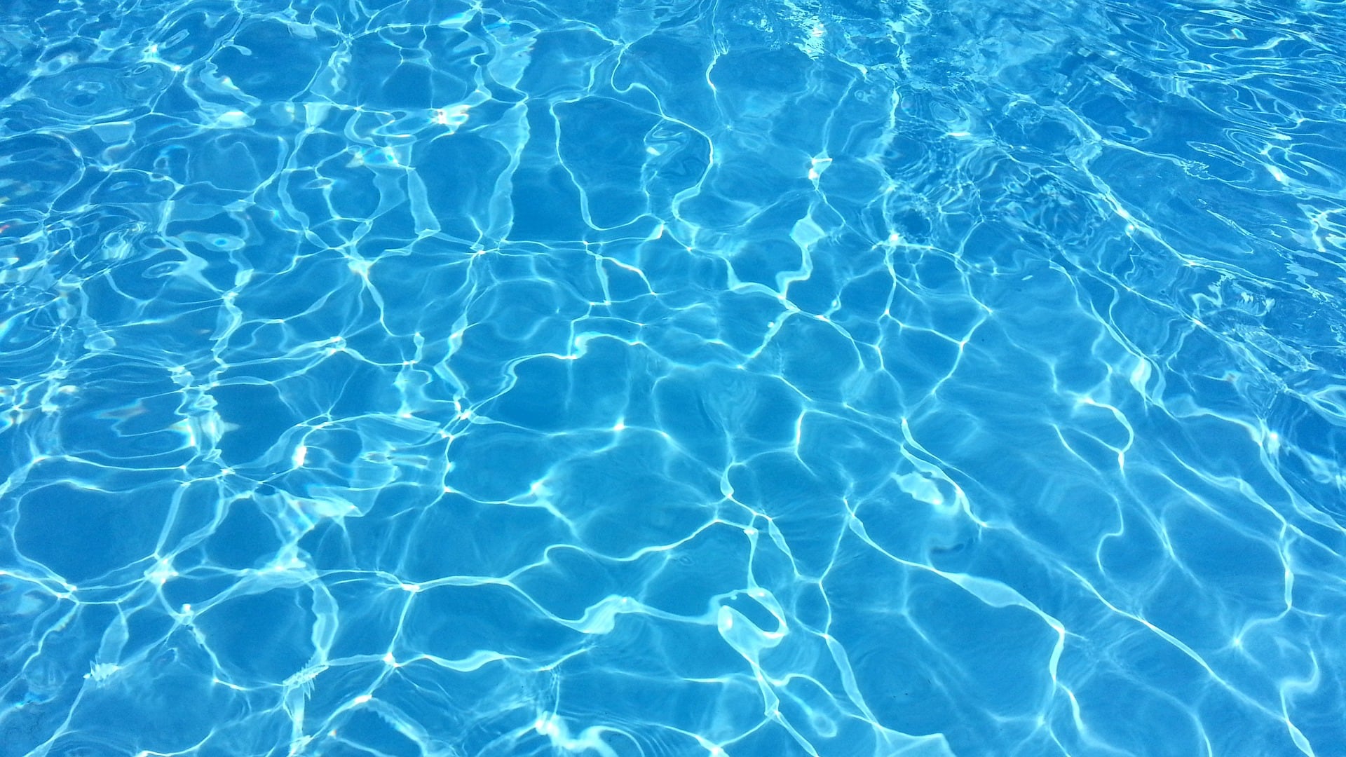
Let’s say you want to use this image as a full page background on your website:

1920x1080.jpg (22 KB)
The image is 1920x1080, but most of those pixels are describing smooth transitions between colors. There is very little actual spatial detail.
Instead of storing all of those pixels, we can store a tiny approximation and let the browser reconstruct the smooth transitions when it scales the image back up.
The trick
- Downsample the image to something tiny, such as
32x18. - Export it in an appropriate image format.
- Stretch it to fill the display area.
The original version of this post used PNG:

32x18.png (1443 bytes)
Use it as a CSS background:
.my-background {
  width: 100%;
  min-height: 100vh;
  background: url(32x18.png) center / cover no-repeat;
}
Or as an <img> element:
<img src="32x18.png" style="width: 100%; height: auto;" alt="" />
Here is the tiny image stretched back up:
32x18.png (1443 bytes)
Can you tell the difference? For this kind of image, the stretched version looks almost identical to the original. The new image is only 1.4 KB, a 93.6% reduction. Here is the original side-by-side comparison.
Why does this work?
When a tiny image is enlarged, the browser uses an interpolation algorithm to estimate the missing pixels.
Normally that is a problem because interpolation cannot recreate detail that is no longer there. Text, sharp edges, texture, and fine patterns quickly become blurry or distorted.
But smooth backgrounds are different. They are mostly made of gradual changes in color and brightness. There is very little information for the browser to reconstruct, so interpolation does a remarkably good job.
Another way to think about it is that these are low-frequency images. Their visual information changes slowly across the image, so their pixel dimensions do not need to match their display dimensions.
More detail requires more pixels
Here is another example:

1920x1080-2.jpg (143 KB)
This image contains more detail, so 32x18 is too aggressive. A slightly larger 128x72 version preserves enough information:

128x72.png (7 KB)
There is no universal ideal resolution. Keep reducing the dimensions until the upscaled result becomes visibly worse, then move back one step.
Blurred photos are another good candidate
This technique also works well for blurred background photos, especially the kind used behind text overlays.

1920x1080-4.jpg (199 KB)

256x144-4.jpg (10 KB)
In 2019 I recommended JPEG here. Today I would also test AVIF and WebP. Modern codecs can often make these already tiny assets smaller still, although the best format depends on the image and encoder settings.
Where it falls apart
This technique is not suitable for images with lots of sharp, high-contrast detail.
1920x1080-3.jpg (337 KB)

128x72-2.png (21 KB)
The tiny version no longer contains enough information for the browser to reconstruct anything close to the original.
For actual photographs, illustrations, screenshots, product imagery, or anything with important detail, use properly sized responsive images instead.
What I would use today
The core technique is still useful today, especially for arbitrary low-detail artwork that you want to preserve exactly rather than recreate procedurally.
1. Tiny AVIF, WebP, or PNG images for low-detail artwork
If you have a smooth abstract background, a mesh-style gradient, a heavily blurred photograph, soft lighting, or any other image where most of the visual information is low-frequency, aggressive downsampling is still a strong option.
The important advantage is that the source artwork can be anything. You do not need to reproduce the image with CSS or describe it mathematically. You simply sample the original image at a much lower resolution and let the browser interpolate between those samples.
A useful way to think about this is:
Don’t model the function. Sample the function.
For smooth visual fields, a 64x36, 128x72, or similarly tiny AVIF, WebP, or PNG asset may be all you need, even when the image will eventually cover a 4K display.
2. Responsive images for real image content
For images where detail matters, use srcset, sizes, and modern formats so the browser can choose an appropriately sized asset:
<img
  src="image-800.avif"
  srcset="
    image-400.avif 400w,
    image-800.avif 800w,
    image-1600.avif 1600w
  "
  sizes="100vw"
  alt=""
/>
That solves a different problem. Instead of intentionally throwing detail away, you give the browser enough detail for the actual display size without downloading more pixels than necessary.
This is also related to LQIP
A common modern image-loading technique is the Low Quality Image Placeholder, or LQIP. A site displays a tiny, blurry version of an image while the full-resolution version loads.
The interesting difference here is that for an intentionally blurry or smooth background, the placeholder can sometimes be the final image:
LQIP:
tiny image -> temporary representation -> full image

This technique:
tiny image -> final representation
If the full-resolution version would not provide any meaningful visual improvement, there is no reason to download it.
So, is this still useful?
Yes. I would describe the technique more narrowly today, but not less enthusiastically.
It is not a general image optimization strategy. It is extreme downsampling for intentionally low-detail imagery.
For arbitrary smooth artwork, mesh-style gradients, soft lighting, or heavily blurred photographs, a comically tiny raster image stretched across the screen can still be one of the cheapest ways to render the original look faithfully.
When detail matters, use responsive images. When it does not, the core idea from 2019 still holds up: if the visual information in an image is predominantly low-frequency, its pixel dimensions do not need to match its display dimensions.
Discuss on Twitter • Edit on GitHub
Keep Reading
- I Built a Custom Event Router, Then Deleted It: Lessons in Knowing When to Stop Building
15 Feb 2025 - AI Generates Configuration, Not Code: How I Use LLMs to Build Product Capabilities
08 Feb 2025 - Schema-Driven Platforms: Why JSON Schema Is the Most Underrated Tool in Your Stack
01 Feb 2025 - Why Use a JavaScript Framework
13 Jul 2019 - Hacking Image Interpolation for Fun and Profit
13 Jan 2019 - The Perils of Jest Snapshot Testing
07 Jan 2019 - A Better Way to Test Your React-Redux App
01 Jan 2019 - Firebase + Create React App
01 Aug 2018 - Partial Application in Action
29 Sep 2017 - Using SVG to Shrink Your PNGs
07 Sep 2014 - Adaptive content everywhere
06 Feb 2013